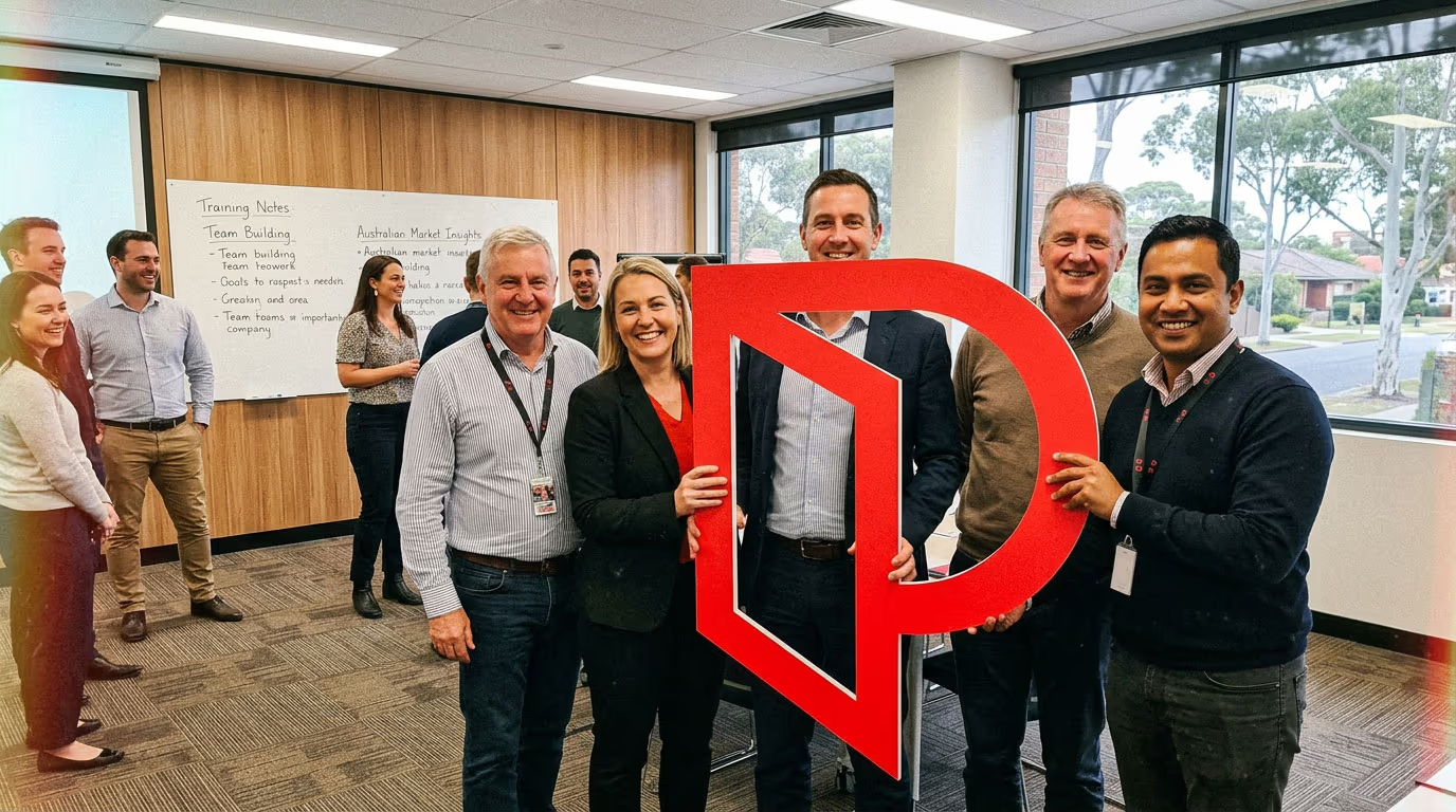
Do not place it in situations that would embarrass your office or the group
If you would not want it on the front page of a local paper, it should not be in the shot.


The Open Door P: A Guide for Professionals Members.
The Competition
Introducing the Open Door P Competition. Show us your best moment with the mark and your office could win a professional content day.
You know the rituals. For this, go further. Here's three ways to think about it.
Make it the star of your next TikTok. Got a mate climbing Everest? Get it in the pack.
Get it on a morning show crossing, in the crowd at the footy, or roadside at the Tour de France.
Use it constantly, in the office and out in the field. Send it home with the team on weekends. It's the office mascot now.
It's not required but sharing is caring. Tag @professionalsrealestate when you post.
Email your entry to marketing@professionals.com.au, subject line Open Door P Competition followed by your office name. Give some context if your entry needs it. Enter as often as you like.

Section 01
Professionals recently introduced a new mark. Not just a new logo. A new way of saying what this membership group has always stood for.
The Open Door P is exactly what it looks like. A door, held open. It speaks to what good agents do every day: open doors for people stepping into new chapters of their lives. A first home. A fresh start. A business built from the ground up.
The Agents of Change campaign carried it into the real world, through real agents in real communities. This guide brings that same energy to the local level. Every time the P shows up in the right moment, with the right people, it tells the story of who we are. Professionals.
Section 02
Agents of Change is not just a campaign. It is a statement about who Professionals people are and the impact they have in the communities where they live and work. Every time you hold the P, you are carrying that statement into a real moment. These are the rituals that bring it to life. Click an image for more info.
Section 03
The P is a great piece of brand equipment. It goes almost anywhere. A few places it does not go:
If you would not want it on the front page of a local paper, it should not be in the shot.
Playful is good. Disrespectful is not. There is a clear difference and you will know it when you see it.
No stickers. No paint. No modifications. It is not a canvas. It is a mark.
The P represents your membership. Keep it relevant.
Use your judgement. If it feels right for the brand and right for the moment, it probably is.
Section 04
There are three sizes, and the logic is simple. The large P is built for groups. It holds its own in a room full of people and reads clearly across a wide shot. The two smaller P's are better suited to singles or pairs, where they sit naturally beside a person rather than towering over them.
For groups
Built for groups. Holds its own in a room full of people and reads clearly across a wide shot.
Section 05
When you take a great shot with the P, do not let it sit in your camera roll. Post it. Tag @professionalsrealestate and use #ProfessionalsRealEstate so the group can find it. And send it through to marketing@professionals.com.au to be considered for the Professionals content library. The best moments from offices across Australia and New Zealand help tell the story of what this membership group actually looks like on the ground.